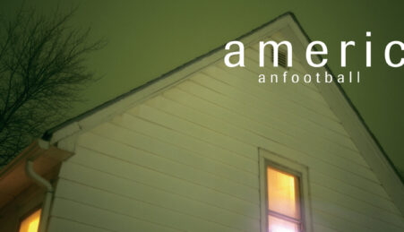
Every December, celebrities flood social media with snapshots of their Christmas celebrations – and their decorations. This year, stars including Kim Kardashian and Victoria Beckham shared images of pared-back, aesthetic trees and minimal décor. While undeniably elegant, these displays hardly embody the spirit of Christmas – appearing stripped of colour, character and warmth.
The festive season no longer feels as vibrant as it once did. Anyone paying attention to their surroundings – and to the rise of minimalist trends – can see how the bold holly reds and deep greens traditionally associated with Christmas have been drained from ornaments, shop displays, and even children’s gifts. This shift has been underway for years, gradually redefining how upcoming seasons as style, how homes are decorated and what is considered appropriate for special occasions. It is impossible to predict what might come next. Perhaps extravagant maximalism will make a return, or perhaps stark black and white decorations will be the way to go. For now, however, colour continues to disappear.
Pantone’s Colour of the Year for 2026, ‘Cloud Dancer,’ reinforces this trend. Described as an elegant, calming and simplistic tone, this white shade was selected to challenge outdated design and “open up new avenues and ways of thinking,” according to Leatrice Eiseman, executive director of the Pantone Colour Institute. Yet this choice feels at odds with how style movements typically work. By selecting such a bland shade, Pantone implies that vibrancy is outdated – and that embracing colour means clinging to the past.
Pantone’s influence extends far beyond symbolism and its selection of a white shade to represent the year will impact production and design trends. Unsurprisingly, the announcement sparked debate online: some argue that white is simply the absence of colour, while others are ecstatic with its simplicity. If you ask me, it is a shame that maximalist styles are being forced out. White being considered the colour of the moment feels particularly unfortunate, especially at this time of the year.
As an adult, it is oddly disheartening to witness this loss of variety at a time of year that should be marked by celebration. I remember growing up surrounded by bright ornaments, multicoloured walls, and decorations so eclectic that it was impossible to establish a single design theme in the house. Now, home and festivity decorations are filled with pastel and neutral shades, with every detail conforming to the minimalistic style of modern interiors.
Trends driven by “development” are largely responsible for this shift. Why do people seem so obsessed with maturity? It’s as if there is a specific age at which liking colour becomes synonymous with immaturity. It is genuinely sad to see how many trends have affected ornament collecting traditions – to see all the websites telling you how to avoid “overdoing” your decorations, ensuring things “match” and what you should do to have the most luxurious space. Design preferences become problematic when they become so intense that there is social rejection of other designs, forcing brands to cut down traditional products to make space for trendy products that will be considered outdated within months.
Liking trends or not is a personal preference, but the impact of losing colour has on people’s experience is not. Christmas is a clear example: red and green are the two shades traditionally associated with the celebration. Red indicates passion, love and confidence, while green symbolises luck, growth and fresh starts. These colours exist in interior design for a reason – they influence emotions. Preserving colour is more than just tradition; it plays a role in human development.
Bright colours are particularly important for children as they stimulate their senses and positively affect emotions. Vivid tones nurture curiosity, encouraging children to explore and engage with their surroundings. So, whether you like it or not, using colourful decorations matters – and it should not be considered basic or outdated to decorate with colours that have a logic behind them.
The loss of colour goes beyond Christmas. With Pantone’s colour selection and the persistence of monotonous home designs, 2026 is in danger of becoming a plain and faded year. Not everything has fit into a modern design. Not all homes need to look the same. Having a colour proclaimed for the year does not make it a rule that everyone should follow.
Younger generations are growing up in toned-down spaces and may continue this neutral life in the future. It is a shame that people are rejecting colourful houses and buildings – places that should represent who you are.
Maybe you are heartbroken that 2026 is set to be the year of “Cloud Dancer” – but it doesn’t have to be. Bring colour back into your life. Pantone’s chosen shade does not have to define your year or your home – choose to leave colourless living behind in 2025.


2 Comments
Incredibly well written and a genuinely engaging read. All points were we well articulated and I feel more observant of the use of colour on infrastructure around me and its quiet effects. Well done Fabi
Loved this article!! We definitely need to bring colors back to the Christmas season… and into our lives!